ShopDreamUp AI ArtDreamUp
Deviation Actions

Private collection, please do not unlock
private drawings such as sketches, portraits and various handmade drawings. Due to the fact that it is not possible to hide folders, I decided to use this form of collecting my works
$100/month


Suggested Deviants


Suggested Collections


You Might Like…


Featured in Groups


Description
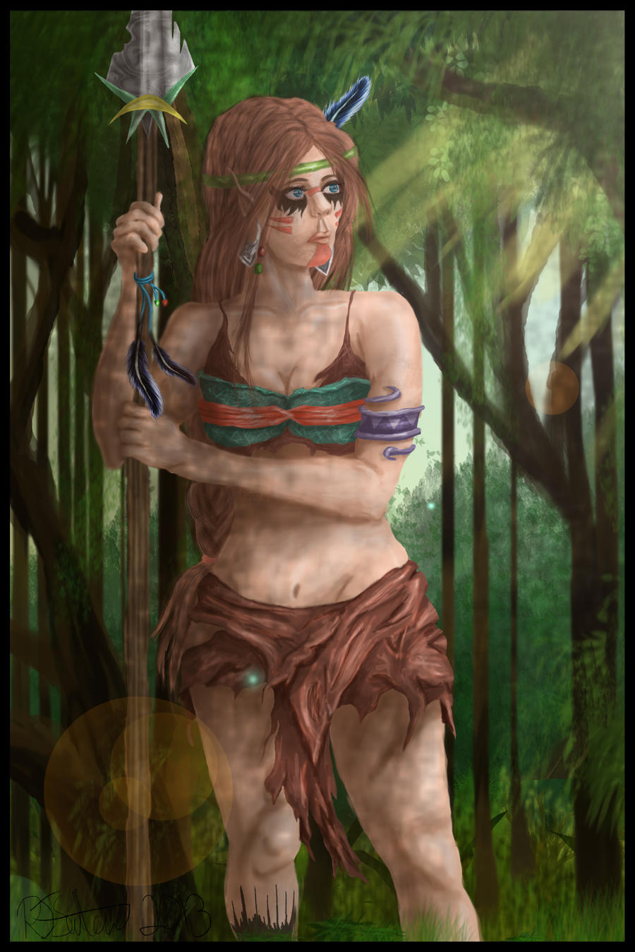
First finished artwork of the new year including my tribal elf character Taahknie. This is her first digital appearance in my gallery and I am pleased with the final product....been working on it since September.
 YAY for forest backgrounds
 ")
Taahknie is form a elvin forest tribe of the air. Air is the element of freedom. The people of air detach themselves to find happiness and freedom. Air is usually related to being adaptable, inquisitive, positive, energetic, restless, and clever.
Since 2011 Taahknie has been in the first finished drawing of the year thought i would continue on with the streak
The markings on her face are done when she hunts and the marking on the leg is a tattoo
Original sketch:

Pose referenced form fav.me/d3ft3g1 by Tasastock
More of Taahknie:


Taahknie is form a elvin forest tribe of the air. Air is the element of freedom. The people of air detach themselves to find happiness and freedom. Air is usually related to being adaptable, inquisitive, positive, energetic, restless, and clever.
Since 2011 Taahknie has been in the first finished drawing of the year
The markings on her face are done when she hunts and the marking on the leg is a tattoo
Original sketch:
Pose referenced form fav.me/d3ft3g1 by Tasastock
More of Taahknie:
Image size
1828x2737px 1.97 MB
Make
Canon
Model
MX870 series
© 2013 - 2024 ArtofBekSutton
Comments10
Join the community to add your comment. Already a deviant? Log In
Thanks for allowing me to criticize your work!
Lets start with the overall look and feel of the picture. My first impression of it is positive. I like the design and the pose, and the composition - although a little safe - works fine.
It doesn't have any problematic tangents (there's one tiny one with her chin and the earring, and the feather of the spear and the top, but these are minor and easy to fix) and I like that the composition is slightly off center (though it might even be better if it was even more off center).
I generally like the look of the character (my favorite part being her hair and earrings). I've only one minor point of critique on the design.
The green and red on her top (being complementary colors) create a focus point on her breasts. I'm not sure if that's what you had in mind, but it's there (- if you want to fix that you could either repeat the red/green in her skirt, change the colors on the top, or be very thoughtful in the way you paint it to prevent it from drawing to much attention).
If you want to add some extra flavor to the design (It's one of your OC's I see so I'm not sure if that's an option) you could consider extending her facepaint and also have some shapes on her tummy and on one of her legs perhaps. It will help to pull the design together if you do it careful.
Anatomy wise you've done a good job! Did you reference her? It looks like you did (and that's a good thing). I like that she actually looks like she's putting some weight on her spear.
The image could use a stronger focus point though. Right now the face and her top are competing for attention with her skirt.
The face is the most detailed, the top comes with the contrasting colors and her skirt has the strongest light/dark and sharpness contrast. Ideally you want to use these tricks to create one area to focus on (usually for characters it's the face).
The character as a whole could do with some extra contrast, to help and define her shapes, and make her stand out from the background a bit more. Her neck blends a bit into her hair, and the same goes for her left (our) side of her waist. It's party because your brush technique and the sharpness in the picture is very equal trough the whole picture (apart from her skirt which is slightly more sharp).
The background serves purpose. I like the colors and it adds a nice atmosphere, but it would be better if it had slightly more depth to it. (both in the layers in the distance, but it could also use a foreground, some bigger leafs or grass blades). If you add a little bit of a rim light to he character it would also help her pop out of the background a bit more (don't over-do it though (Wink)") ).
).
I'm not a huge fan of the dappled light effect in this. I like the idea and I see where you are going with it. It works ok in some area's ( I like it on her hands) but it feels out of place on her left (our left) leg and in the shadow under her crossing arm for instance. If you pick the area's on which to add this effect more careful and add a little contrast to it it could look good though (it's the execution, not the idea that needs tweaking).
Finally, I recommend getting rid of the lens flare. It feels a bit out of place as the forest doesn't seem that extremely sunny (that or make the forest look more sunny).
- (I now see that she actually has paint on her left(our left) leg. I mistook it for grass that was in front of her leg at first though. It's very sharply painted and in a different style than her other facepaint, that's what caused my confusion.)
- if some of these idea's are confusing, let me know. I wouldn't mind doing a quick paint over to illustrate them but I won't do that without your permission.
I've done quite a bit of nitpicking. Overall though, I think it's a good drawing, that has the potential to become a great drawing if you tweaked some of the things I've mentioned! I hope this feedback is of use (don't be discouraged by it, I usually only go in this lvl of nitpicking if I feel like the artist is good enough to handle it, so in a way it's a compliment). If you happen to edit her, don't hesitate to show it .
Lets start with the overall look and feel of the picture. My first impression of it is positive. I like the design and the pose, and the composition - although a little safe - works fine.
It doesn't have any problematic tangents (there's one tiny one with her chin and the earring, and the feather of the spear and the top, but these are minor and easy to fix) and I like that the composition is slightly off center (though it might even be better if it was even more off center).
I generally like the look of the character (my favorite part being her hair and earrings
The green and red on her top (being complementary colors) create a focus point on her breasts. I'm not sure if that's what you had in mind, but it's there (- if you want to fix that you could either repeat the red/green in her skirt, change the colors on the top, or be very thoughtful in the way you paint it to prevent it from drawing to much attention).
If you want to add some extra flavor to the design (It's one of your OC's I see so I'm not sure if that's an option) you could consider extending her facepaint and also have some shapes on her tummy and on one of her legs perhaps. It will help to pull the design together if you do it careful.
Anatomy wise you've done a good job! Did you reference her? It looks like you did (and that's a good thing). I like that she actually looks like she's putting some weight on her spear.
The image could use a stronger focus point though. Right now the face and her top are competing for attention with her skirt.
The face is the most detailed, the top comes with the contrasting colors and her skirt has the strongest light/dark and sharpness contrast. Ideally you want to use these tricks to create one area to focus on (usually for characters it's the face).
The character as a whole could do with some extra contrast, to help and define her shapes, and make her stand out from the background a bit more. Her neck blends a bit into her hair, and the same goes for her left (our) side of her waist. It's party because your brush technique and the sharpness in the picture is very equal trough the whole picture (apart from her skirt which is slightly more sharp).
The background serves purpose. I like the colors and it adds a nice atmosphere, but it would be better if it had slightly more depth to it. (both in the layers in the distance, but it could also use a foreground, some bigger leafs or grass blades). If you add a little bit of a rim light to he character it would also help her pop out of the background a bit more (don't over-do it though
I'm not a huge fan of the dappled light effect in this. I like the idea and I see where you are going with it. It works ok in some area's ( I like it on her hands) but it feels out of place on her left (our left) leg and in the shadow under her crossing arm for instance. If you pick the area's on which to add this effect more careful and add a little contrast to it it could look good though (it's the execution, not the idea that needs tweaking).
Finally, I recommend getting rid of the lens flare. It feels a bit out of place as the forest doesn't seem that extremely sunny (that or make the forest look more sunny).
- (I now see that she actually has paint on her left(our left) leg. I mistook it for grass that was in front of her leg at first though. It's very sharply painted and in a different style than her other facepaint, that's what caused my confusion.)
- if some of these idea's are confusing, let me know. I wouldn't mind doing a quick paint over to illustrate them but I won't do that without your permission.
I've done quite a bit of nitpicking. Overall though, I think it's a good drawing, that has the potential to become a great drawing if you tweaked some of the things I've mentioned! I hope this feedback is of use (don't be discouraged by it, I usually only go in this lvl of nitpicking if I feel like the artist is good enough to handle it, so in a way it's a compliment